


User Interface (UI) design plays a crucial role in crafting user-friendly digital experiences. Don't believe me? Here are some incredible UI statistics
94% of first impressions of a website is directly related to its design.
A website is vey often one of the first real interactions that your potential customers will have.
Initial judgment on a website's credibility is 75% based on its overall aesthetics.
In this tutorial, we'll delve into the fundamental principles of layouts, covering grids, line length, margins, rule of thirds, type sizes, alignment and spacing. By understanding the reasons behind these practices, you'll be better equipped to create engaging user interfaces.
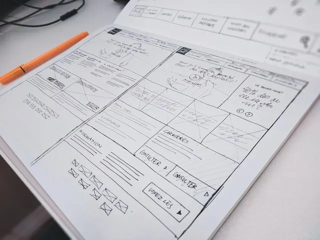
Grids: Laying the foundations
Grids are the hidden architecture of almost all forms of graphic, print and web design. It is used to get an idea of the composition and structure, or 'feel', of a page. Implementing thoughtful layouts offers several advantages:
- Feel for design early: using simple grid guidelines you can start to see an outline of what you are going to make. This helps to set the building blocks of the design while the lines are still loose and easy ot change. An effective layout provides a clear structure and helps users navigate content with ease.
- User-Focused Flow: A well-designed layout guides users through the content in a natural and intuitive sequence.
- Improved Scannability: A structured layout enables users to quickly scan and locate information, improving usability.
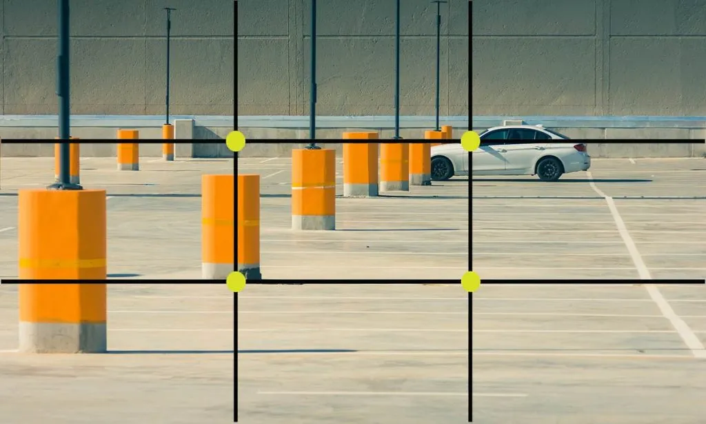
Rule of thirds
The Rule of Thirds is a basic principle in photography, art, and design that helps create visually appealing and balanced compositions. It involves dividing an image into nine equal parts by overlaying two equally spaced horizontal lines and two equally spaced vertical lines, resulting in a grid with four intersections points.
Line length: Keeping people interested
Ever noticed that Google results (desktop) have a really thin width despite it being a massive white page. It's to make the results scannable. Columns of text should have a minimum of 6 words. This will make the text you are reading feel less jittery and more structured.
Shorter lines are more comfortable to read than longer lines. As line length increases, your eye has to travel farther from the end of one line to the beginning of the next, making it harder to track your progress vertically. Aim for an average line length of 45–90 characters, including spaces.

Alignment: Achieving Visual Harmony
Alignment is a cornerstone of good design, bringing a sense of order and visual harmony to your interface. When elements are aligned, users can easily process and navigate your content.

- Enhances Readability: Aligned text and images are easier to read and comprehend.
- Creates Balance: Symmetrically aligned elements create a sense of balance and professionalism.
- Aids Scannability: Aligned elements guide users' eyes along a logical path, improving content consumption.
Spacing: Consistency and Proportion
Maintaining consistent spacing is more than just a design rule, it serves practical purposes that contribute to a polished design. At school we were taught to use increments of 8px across web designs. This allows everything on the page to look related and as it had a lot of multiples you can get away with using lots of values that are still related. You can often see this principle mimicked in css frameworks, such as Tailwind.
- Enhances Readability: Proper spacing prevents elements from crowding, ensuring text and images are easily distinguishable.
- Provides Structure: Multiples of 8 create a structured layout that aligns with users' expectations, making it easier to navigate.
- Achieves Proportion: Consistent spacing fosters a sense of proportion, guiding users' attention to the right elements.
Margins: Creating Breathing Space
Margins are not just empty gaps; they contribute to the overall design's cohesiveness and user experience.
- Visual Separation: Margins create a clear separation between elements, the more related an item, the closer the margins. Reducing visual clutter massively improves legibility.
- Aesthetic Appeal: Ample margins give your design a clean and sophisticated look, making it visually appealing.
- Focus and Attention: Well-placed margins draw attention to essential elements, directing users' focus effectively.
Whitespace: Embracing Simplicity
Whitespace is a powerful tool that offers several benefits for both aesthetics and usability.
- Clarity and Focus: Whitespace allows users to focus on the content by reducing distractions and visual noise.
- Improved Readability: Ample whitespace around text enhances readability and comprehension.
- Elegance and Sophistication: Thoughtful use of whitespace conveys a sense of elegance and professionalism.
Type sizes: Showing Heirarchy
Then you can show something less important with h2
Now a h3
Getting small at h4
Tiny at h5: much less important
Basically ignore this h6
By organizing elements hierarchically, you emphasize key content and facilitate user engagement.
Conclusion
Understanding the reasons behind UI design principles empowers you to create awesome interfaces. By embracing these practices, you ensure that your designs are user-centric, intuitive, and visually pleasing. Remember, while these principles provide a solid set of foundations, always adapt them to suit your project's specific needs, and let your creativity shine as you craft remarkable digital interfaces.