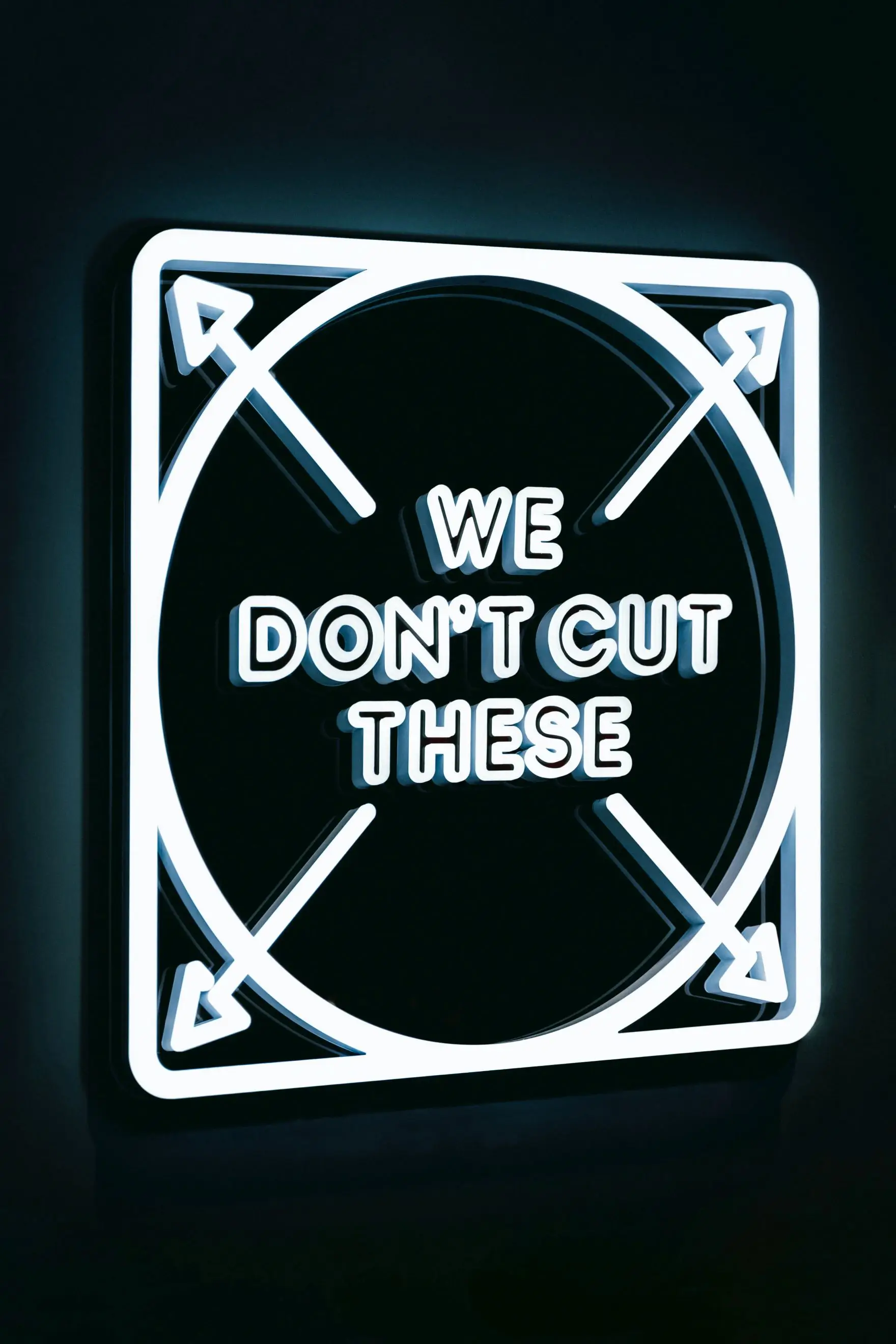


Of all the reasons to stop using a font, having it drown is probably the most remarkable.
Typography is an art form that weaves letters into captivating narratives. The Doves typeface is a testament to the power of typography to tell a story beyond words.
We are about to embark on a captivating journey through the fascinating history of the Doves Roman typeface – a revival that breathed new life into a lost treasure of the printing world.
The Birth of Doves Typeface (Early 1900s):
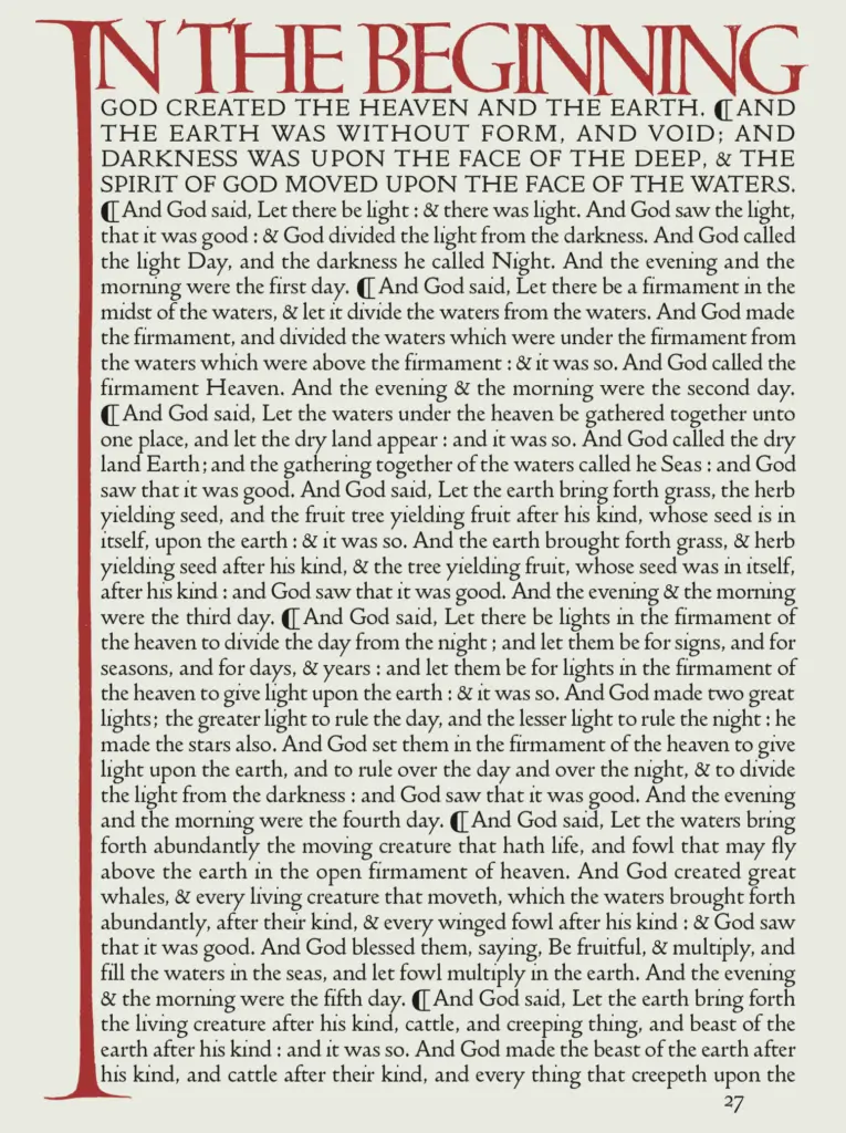
Our story begins in the early twentieth century, specifically in the year 1900, when two visionaries, Thomas James Cobden-Sanderson and Emery Walker, embarked on a collaborative project that would shape the future of typography. They founded 'THE DOVES PRESS', which During nearly seventeen years of operation, produced some of the finest & most notable examples of twentieth century typography to date.
The crown jewel of this was the Doves typeface. It owed its aesthetic roots to the pioneering work of Nicolas Jenson, a Venetian printer from the fifteenth century. Percy Tiffin's drawings, based on Jenson's innovative Venetian type, served as the foundation for the Doves typeface's graceful curves, clean lines, and classic proportions. This historical lineage added a layer of depth and connection to the Doves typeface, imbuing it with the spirit of centuries past.
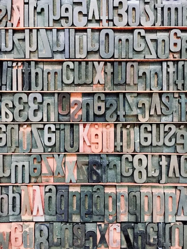
The task of bringing this vision to life fell into the hands of master punchcutter Edward Prince, who meticulously translated drawings produced by Percy Tiffin into the intricate metal type that would become known as the Doves typeface.
Partnership dissolved (1908)
As the Doves Press flourished, so did the creative tensions between its founders. When the partnership was formally dissolved in 1909, a legal agreement was drawn up whereby the two men would share the type; Cobden-Sanderson could retain its exclusive use (including all the type punches and matrices needed to print) to continue printing Doves Press publications until his death, whereupon ownership would then pass to Walker.
A Drastic Decision (1916):
Determined to safeguard the integrity of the Doves typeface, Cobden-Sanderson took drastic action. He embarked on a mission that would ultimately shape the legacy of the typeface – a mission to physically destroy the metal type and matrices that comprised the Doves typeface.
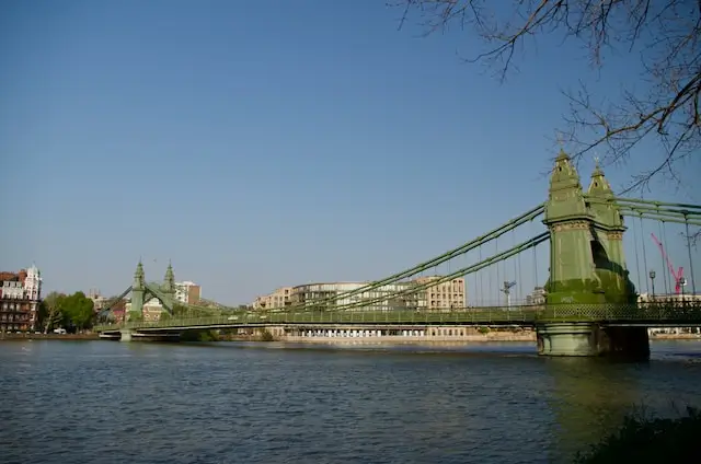
The River Thames Affair (1917-1918):
From 1917 to 1918, Cobden-Sanderson executed his audacious plan with meticulous precision. Under the cover of darkness, he cast the metal type and matrices from the Hammersmith Bridge into the River Thames, one piece at a time.
Over the next 5 months, he had made the half mile trip more than a hundred seperate times (at this point he was seventy-six!), hauling over a ton of type, until it was gone.
This clandestine act was an embodiment of Cobden-Sanderson's unwavering commitment to the exclusivity of the Doves typeface. As the metal sank into the river's depths, it marked the end of an era and the beginning of a mysterious chapter in the typeface's history.
Decades of Obscurity and Rediscovery (20th-21st Century):
Following its watery interment, the Doves typeface slipped into obscurity. The typeface remained hidden beneath the river's surface, its story known to only a few passionate typographic historians. However, in 2014, the tides of fate shifted once again. Robert Green, a designer and typographer, stumbled upon remnants of the Doves typeface in the muddy banks of the Thames. This serendipitous discovery ignited a renewed interest in the typeface and set the stage for a remarkable revival.
The Revival (2014-Present):
Green's discovery rekindled the flame of fascination with the Doves typeface. Driven by a deep respect for its historical significance, Green embarked on a painstaking journey to recreate the lost typeface. Armed with surviving printed material, historical records, and modern digital tools, Green meticulously reconstructed the Doves typeface character by character. His dedication breathed new life into the typeface, capturing its essence and enabling it to grace modern publications and designs.
The Legacy Lives On:
Today, the Doves typeface stands as a living testament to the enduring power of typography. Green's revival efforts have ensured that this once-lost treasure continues to captivate and inspire designers, typographers, and enthusiasts alike. The Doves Type Revival project, born from a desire to honor the legacy of Cobden-Sanderson and Walker's creation, has bridged the gap between history and innovation, preserving the beauty and craftsmanship of a bygone era for generations to come.
The tale of the Doves typeface is a captivating narrative that spans centuries, continents, and the depths of a river.
From its birth as a collaborative vision in the early 1900s to its revival and continued relevance in the twenty-first century, the Doves typeface exemplifies the profound impact of art and dedication.
This tale reminds us that even lost art forms can be resurrected, inviting us to traverse the river of time and appreciate the intricate beauty of typographic craftsmanship.